Site Coordinator Admin Dashboard.mp4
Overview
The Site Coordinator Dashboard lives directly on the Scholis homepage rather than on a separate admin URL. It is a widget that sits below your course tiles and gives administrators a read-only, reportable view into every organization, student, teacher, section, enrollment, and progress record tied to your school. Access to it is confirmed by the blue “ADMINISTRATOR” badge shown in the top-right corner of the widget, next to your account name.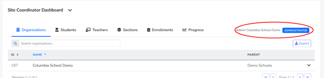
After logging in, you land on the Scholis Home page. Simply scroll down past the “Announcements” section and past your “My Courses” tiles (you'll notice a tile called “Site Coordinators hub,” which is a separate training course, not the dashboard itself). The dashboard widget titled “Site Coordinator Dashboard” appears right underneath the course tiles, and it can be collapsed or expanded using the small arrow next to its heading.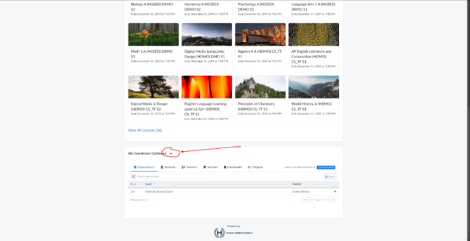
Once expanded, the dashboard presents six tabs across the top: Organizations, Students, Teachers, Sections, Enrollments, and Progress. Each tab loads a sortable, searchable table, and each includes an “Export” button in the top-right for pulling the data out into a file.
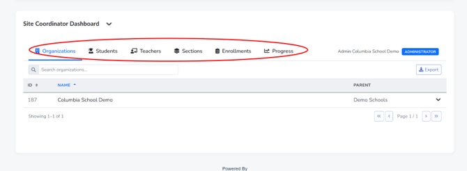
The Organizations tab lists the school/org units tied to your account, showing an ID, Name, and Parent organization, with an expandable row for drilling into sub-organizations.
The Students tab lists every enrolled student with ID, username, first/middle/last name, and an expandable chevron per row for more detail.
The Teachers tab lists teaching staff with ID, first/last name, and email address.
The Sections tab lists course sections with ID, Name, Code, and Status (e.g., Active or Archived), and includes an “Active only” toggle to hide archived sections.
The Enrollments tab ties students to specific sections, showing start/end dates, active status, current grade, and letter grade, with toggles for “Active only” and “At Risk only.”
The Progress TabThe Progress tab is the most detailed view. It opens with a color-coded status summary bar (Performing Well, needs attention, At Risk, Zero Work) tallying how many students fall into each category. An expandable “How is status determined?” link reveals the exact grading logic, cross-referencing grade percentage and pacing percentage against where the student is in the semester (early, mid, or late).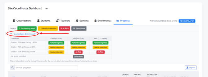
Below that summary, the same searchable/exportable table format appears, listing each student's name, course, teacher, grade, pacing percentage, semester percentage, assignment completion, and status badge.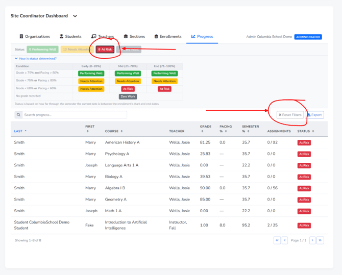
A few things are consistent across all six tabs: a search box at the top-left of each table lets you filter by name or keyword, column headers are clickable to sort ascending/descending, rows often have a chevron on the right to expand additional detail, and the “Export” button (top-right) lets you download the current table's data. Because everything lives in one widget on the homepage, switching between tabs just means clicking the corresponding label — there's no page reload involved.